Entries from September 1, 2007 - September 30, 2007

Sunday
Sep162007

Snail Telegraphy

 snails2.jpg

The Proceedings of the Athanasius Kircher Society is a wonderful repository of the strange and bizarre.  Browsing its pages is  an ideal way to while away an spare hour or two.  Today I came across there this 19th century proposal to use telepathy between snails as a means for communicating over long distances.

Friday
Sep142007

Everyday Graphs, No 2: Losing Weight

losing-weight.JPG

Like many women, my wife Liz often worries about her weight.  A few months ago she decided to make a determined effort to avoid high calorie foods and to get more exercise.  She started weighing herself frequently and recording the results in her diary.  However, it never seemed to occur to her to plot a graph of the results.  Instead she seemed to judge her progress on whether  the current measure was up or down on the previous one.  She would come home and say "I've put on 2 pounds!" and be sad, or "I've lost 2 pounds!" and be happy. 

I tried to explain to her about measurement error and that 2 pounds was probably not a significant difference, but she just wouldn't listen.  On one occasion she became quite distressed because, apparently, she had suddenly "put on 10 pounds", only to find, to her great relief, that "it all came off again" the following day.  I repeatedly told her that she should not be concentrating on the difference between the last two measurements but, instead,  should be looking at the overall trend, and for that you need to plot a graph. 

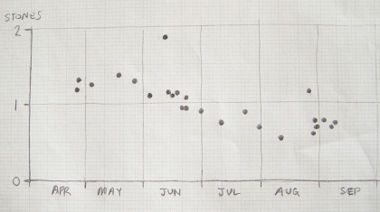
Eventually, I got her to sit down at the kitchen table with her diary and together we plotted the  measurements out.  The the result was the above graph (except that I have subtracted an arbitrary constant from all the values to disguise the true weights - we are only interested in the differences here).  There are three things to notice about this graph:

  • The points show a clear and unambiguous downward trend.  Liz is successfully losing weight: over 4 months she had lost about 7 pounds.  I was surprised by this; from the way she had been going on I had assumed that she must be actually putting weight on.
  • All but 2 of the points scatter within a few pounds of the downward trend line.  I was correct in saying that a difference of 2 pounds between two consecutive measurements was not worth worrying about.
  • However, there are 2 points that stand well above the trend line and these require some explanation.  But they are almost certainly not the result of Liz suddenly putting on a lot of weight and then losing it all the following day.  Somehow those measurements must have been faulty.  There are various ways this could happen but I like to think that Liz forgot to put her handbag down before she stepped onto the scales.

Without plotting the graph, Liz would probably never have realised that her weight was slowly and steadily going down.  Instead, she would have continued to be distracted by insignificant changes and the occasional faulty measurement.  With the graph these can be clearly seen for what they are: irrelevant.  Indeed, I would go as far as to say that any method of weight loss should include graph plotting if it is to be effective.  Anyone attempting to lose weight must get a feel for how their weight changes over time and a graph is the best thing for giving that feel

(Postscipt: The latest measurement, on September 15th, comes in at just under 0.5 stone on the above scale, so the downward trend is continuing.  It looks as if Liz is on target for having lost 1.0 stone by November.)   

Friday
Sep142007

Investors in People

It always amuses me to see the Investors in People plaque on the side of the local crematorium.   I would have thought Disposers of People would be more appropriate.

Wednesday
Sep122007

Everyday Graphs, No 1: The Monday Morning Effect

days-off.JPG

Ever since I started observing variable stars at the age of 11, I have used rough, quickly-drawn graphs as a way of getting a feel for the behaviour and consistency of numerical data.   At the end of a long observing session I would often sit down beside the fire with a cup of cocoa and do quick free-hand sketches of the light-curves of the eclipsing binary stars that I had been following through the night.  This enabled me to see if anything unexpected had occurred and, if necessary, to plan follow-up observations on later nights. 

I now no longer observe variable stars (not since becoming a parent) but I occasionally come across data which leads me to plot a quick graph.  This happened earlier this summer when I received my daughter Zoe's school report.  I had got a vague feeling over the year that Zoe was occasionally feigning sickness, especially on Mondays.  But, as I normally have to leave for work before Zoe goes for her school bus, I have always given her the benefit of the doubt.  However, when I saw an attendance table in the back of her school report I  immediately totted up the absences for each day of the week and plotted the results in the above graph.  I was astounded:  Zoe's sickness rate varied almost linearly from 15% on Mondays down to 0% on Fridays.  I showed Zoe the graph and she too was quite surprised by it. 

The most likely cause of this Monday morning effect is that Zoe was staying up too late at night on the weekends.  The tiredness produced by this could persist through Tuesday and Wednesday to produce the observed linear decrease in 'sickness' throughout the week.  Another possibility, that Zoe had more lessons she didn't like early in the week, can be discounted because it would be very unlikely that her lessons were so arranged as to produce the linear decrease.  So, this year Zoe will be in bed by 10:30pm at weekends and getting up by 08:30am.  I have stuck the above graph on the fridge door to remind me (and Zoe) and am looking forward to her next school report so I can plot this year's attendance data and see if the new regime has had the desired effect.

Friday
Sep072007

Friday Afternoon Commute

On Fridays I often finish work at 1pm.  Normally I catch the fast train from Farnborough North direct back to Reading but yesterday, wanting to go to the barber's at Earley, I caught the train from Frimley to Ascot in order to connect with the Waterloo to Reading stopping train.

As we approached Ascot, I got up as usual and stood by the door to get a better view of the woodland on the inside of the curve into platform 3 and was rewarded by the sight of a largish deer hiding in the shade at the back of the wood and a fox curled up in the sun closer to the tracks.

Later on, at the barber's shop I felt too tired to read so I just gazed out of the windows while waiting my turn.  In a gap between two buildings, a red kite appeared, spiraling slowly on a up-draft.  I watched it do three full circles before it drifted off westward and out of my view.