The BBC Weather Website
For many years now I have used the BBC Weather website as my main source of weather information. I link directly to the forecast for Reading (https://www.bbc.co.uk/weather/2639577):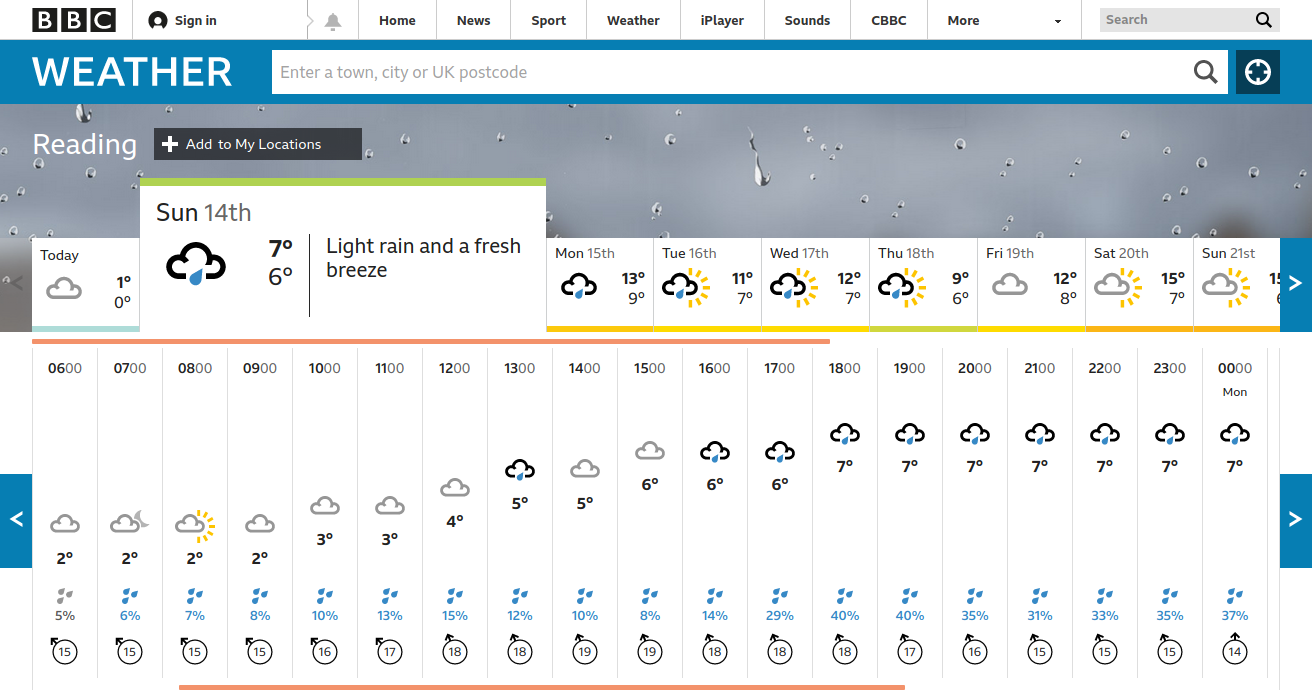
The forecast is presented in two rows. The upper row gives a summary forecast for each day in the coming two weeks. If you click on a particular day then the lower row shows a summary forecast for each hour of that day. Nice and simple, or it should be.
Unfortunately there are a number of things wrong in the implementation that annoy me intensely.
1. Each day starts at 6am and continues till 5am the following day. Now I understand that BBC television and radio program listings have always started at 6am (or at least since programs first extended past midnight). They wanted to break the listings at a time when fewest people would be affected. But this is weather and weather is continuous. It is just plain stupid to force people to click on Sunday 14th to get the forecast for 5am Monday 16th. And yes, people are affected by this stupidity. Until recently I was getting up at 5am to travel to work and one the first things I would do each day was look at the BBC Weather. I always had to remember that it was yesterday's 5am forecast that I wanted.
2. Click the right arrow in the lower row to see the forecasts for the first few hours of the following day:
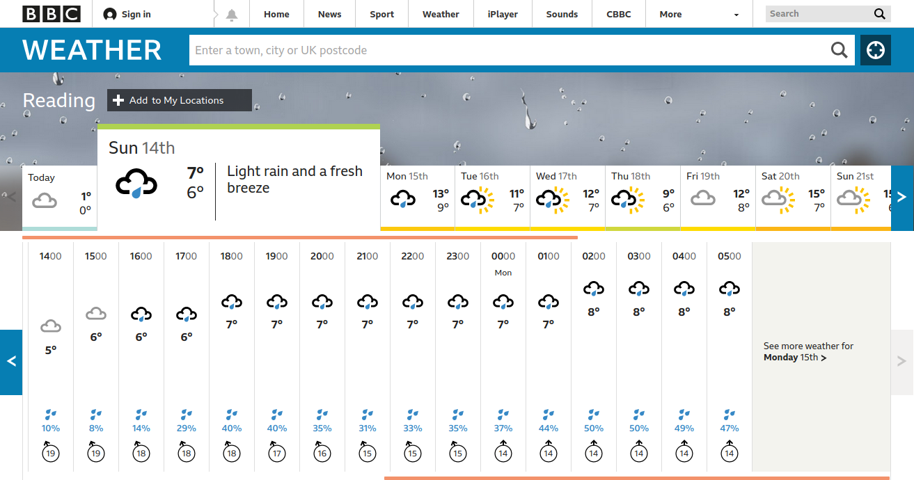
The lower row moves left and now shows forecasts up to 5am the following day. The right arrow is now disabled and instead we have a link "See more weather for Monday 15th". This is totally unnecessary. The arrow could have been left enabled and link omitted and 3 more hours displayed instead. The only reason I can see for having the link is to explicity move on to the next day in the upper row. But that can just as well be done with the right arrow. Making it clear which hours in the lower row belong to which day in the upper row might need some care but it wouldn't be too difficult.
3. The worst thing about the site are the temperatures shown in the top row. They appear to be maximum and minimum temperatures for each day but they do not match the maximum and minimum hourly temperatures for the days in the lower row. For example: on Sunday 14th the hourly figures show 2C at 6am and rise steadily to 7C the following midnight yet the upper row shows a range of 6C to 7C which is clearly wrong. In general the maximum figure in the top row is accurate but the minimum is often grossly misleading.
Now I think about it, 3 is probably just a plain bug. The daily max and min are being calculated over the wrong range of hours or something like that. If so then it is no wonder the developer got confused with all the previous obfuscations over what is a day. 1 and 2 might be results of the developer not having the confidence to say "No this is stupid! I will do it the proper way" or not having the experience to recognise the proper way.
Another thing that occurs to me is that all the data on this page could have been shown just as effectively in one or two simple HTML tables.
 Tristram Brelstaff
Reader Comments